 手机版
手机版

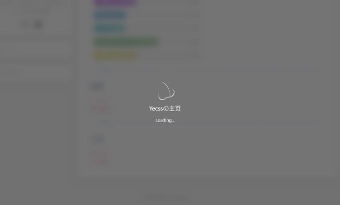
如何给网页加入加载动画呢?简单的来说,就是提前准备好一个加载动画的效果在页面上,利用 JS 判断页面是否加载完成,加载完成后隐藏或者移除动画即可。如下图:
具体的实现
HTML部分
<!--加载动画 start-->
<div id="loading-box">
  <div class="loading-left-bg"></div>
  <div class="loading-right-bg"></div>
  <div class="spinner-box">
    <div class="loader">
      <div class="inner one"></div>
      <div class="inner two"></div>
      <div class="inner three"></div>
    </div>
    <div class="loading-word">
      <p class="loading-title" id="loading-title">Yecssの主页</p>
      <span id="loading-text">Loading...</span>
    </div>
  </div>
</div>
<!--加载动画 end-->
CSS部分
#loading-box .loading-left-bg,
#loading-box .loading-right-bg {
  position: fixed;
  z-index: 999998;
  width: 50%;
  height: 100%;
  background-color: rgb(81 81 81 / 80%);
  transition: all 0.7s cubic-bezier(0.42, 0, 0, 1.01);
  backdrop-filter: blur(10px);
}

#loading-box .loading-right-bg {
  right: 0;
}

#loading-box > .spinner-box {
  position: fixed;
  z-index: 999999;
  display: flex;
  justify-content: center;
  align-items: center;
  width: 100%;
  height: 100vh;
}

#loading-box .spinner-box .loading-word {
  position: absolute;
  color: #ffffff;
  font-size: 0.95rem;
  transform: translateY(64px);
  text-align: center;
}

p.loading-title {
  font-size: 1.25rem;
  margin: 20px 10px 4px 10px;
}

#loading-box .spinner-box .configure-core {
  width: 100%;
  height: 100%;
  background-color: #37474f;
}

div.loaded div.loading-left-bg {
  transform: translate(-100%, 0);
}

div.loaded div.loading-right-bg {
  transform: translate(100%, 0);
}

div.loaded div.spinner-box {
  display: none !important;
}

.loader {
  position: absolute;
  top: calc(50% - 32px);
  left: calc(50% - 32px);
  width: 64px;
  height: 64px;
  border-radius: 50%;
  perspective: 800px;
  transition: all 0.7s cubic-bezier(0.42, 0, 0, 1.01);
}

.inner {
  position: absolute;
  box-sizing: border-box;
  width: 100%;
  height: 100%;
  border-radius: 50%;
}

.inner.one {
  left: 0%;
  top: 0%;
  animation: rotate-one 1s linear infinite;
  border-bottom: 3px solid #efeffa;
}

.inner.two {
  right: 0%;
  top: 0%;
  animation: rotate-two 1s linear infinite;
  border-right: 3px solid #efeffa;
}

.inner.three {
  right: 0%;
  bottom: 0%;
  animation: rotate-three 1s linear infinite;
  border-top: 3px solid #efeffa;
}

@keyframes rotate-one {
  0% {
    transform: rotateX(35deg) rotateY(-45deg) rotateZ(0deg);
  }

  100% {
    transform: rotateX(35deg) rotateY(-45deg) rotateZ(360deg);
  }
}

@keyframes rotate-two {
  0% {
    transform: rotateX(50deg) rotateY(10deg) rotateZ(0deg);
  }

  100% {
    transform: rotateX(50deg) rotateY(10deg) rotateZ(360deg);
  }
}

@keyframes rotate-three {
  0% {
    transform: rotateX(35deg) rotateY(55deg) rotateZ(0deg);
  }

  100% {
    transform: rotateX(35deg) rotateY(55deg) rotateZ(360deg);
  }
}
js部分
//加载完成后执行
window.addEventListener(
  'load',
  function () {
    //载入动画
    $('#loading-box').attr('class', 'loaded')
    $('#bg').css(
      'cssText',
      'transform: scale(1);filter: blur(0px);transition: ease 1.5s;'
    )
    $('.cover').css('cssText', 'opacity: 1;transition: ease 1.5s;')
    $('#section').css(
      'cssText',
      'transform: scale(1) !important;opacity: 1 !important;filter: blur(0px) !important'
    )
  },
  false
)